


Understand Your Ticket Inflow Patterns at a Glance


Flying Blind on Ticket Volume Hurts Your Support Team
Without visibility into when and where tickets are coming from, support managers struggle to allocate resources effectively. Peak hours catch teams off guard, certain channels get overwhelmed, and staffing decisions become guesswork.
HappyFox Inflows Report gives you complete visibility into ticket creation patterns by channel, category, and time period. Spot trends, identify your busiest and calmest periods, and make data-driven decisions to optimize your support operations.
What is the Inflows Report in HappyFox?
The Inflows Report breaks down ticket creation by category and channel, helping you monitor ticket counts and observe inflow trends to understand which hours, days, months, or quarters are busiest or calmest.
Total
Tickets Created
See the complete count of tickets created across all channels and categories for any time period.
Daily
Average Tickets/Day
Track your average daily ticket volume across all days of the week.
Compare
Weekday vs Weekend Patterns
Compare average tickets on weekdays (Mon-Fri) versus weekends (Sat-Sun) to optimize staffing.
Inflow Analytics That Turn Data into Actionable Insights
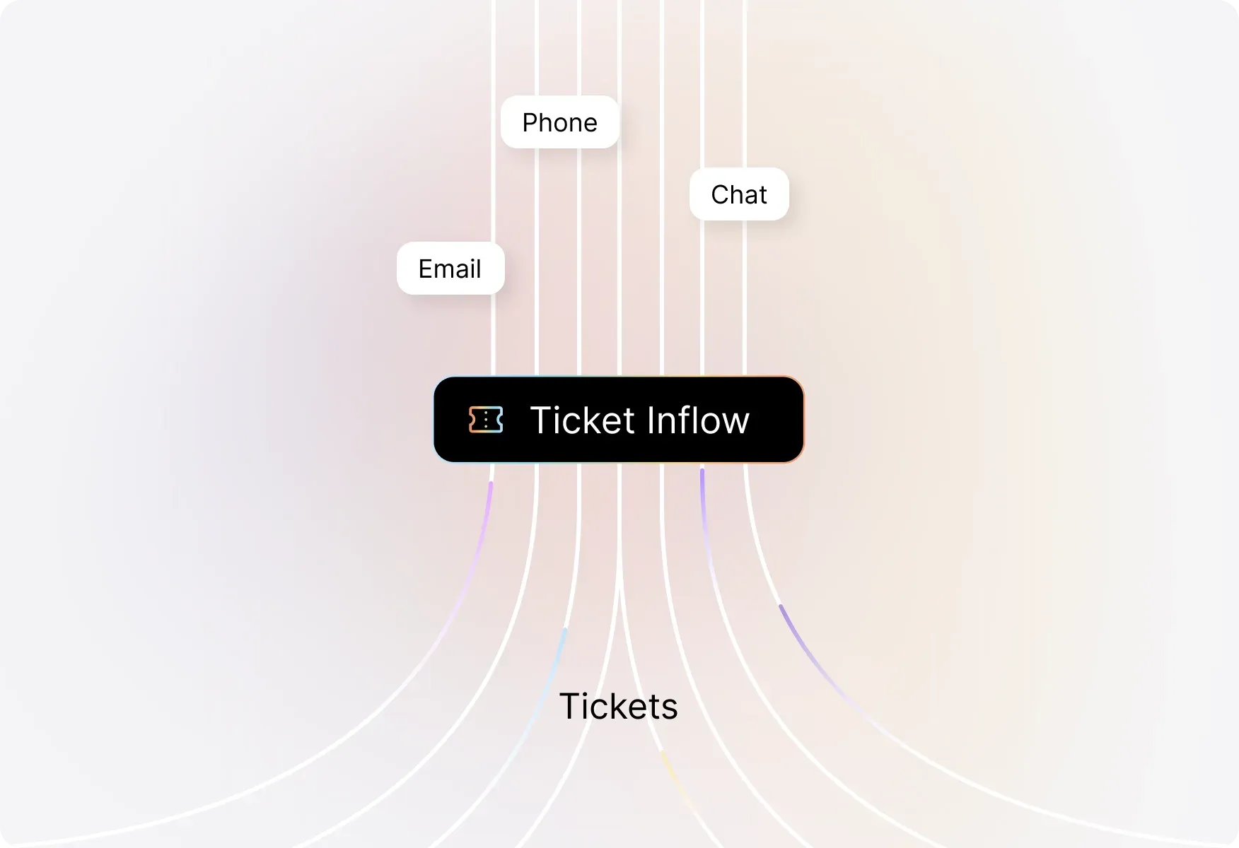
See Which Channels Drive the Most Tickets
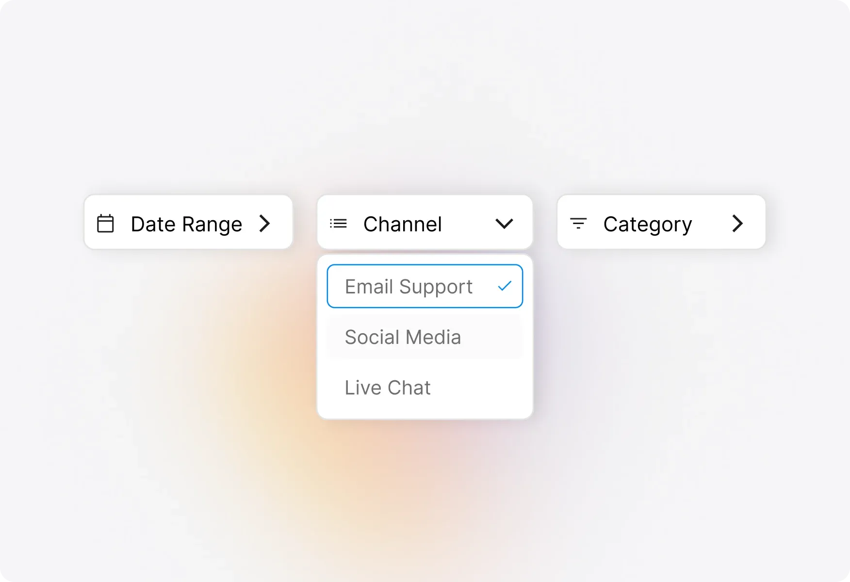
Inflow by Channel
Visualize ticket creation across all your support channels—email, chat, phone, web portal, and more. Identify which channels need more attention and allocate resources accordingly.
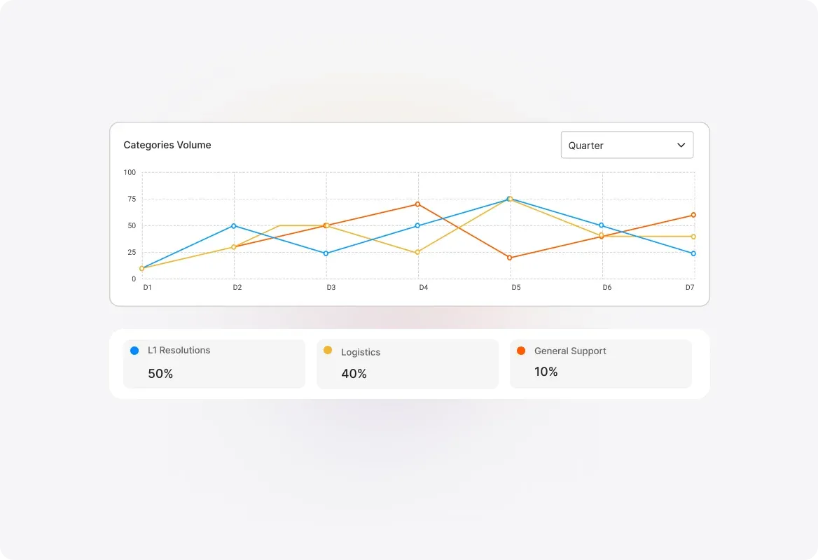
Identify Your Highest-Volume Categories
Inflow by Category
Understand which ticket categories receive the most requests and which get the least. Spot trends in issue types and proactively address recurring problems before they escalate.
Drill Down into Channel-Category Combinations
Channel Distribution Across Categories
Get granular insights by seeing how tickets are distributed across categories and their respective channels. Understand exactly where your tickets are coming from and why.
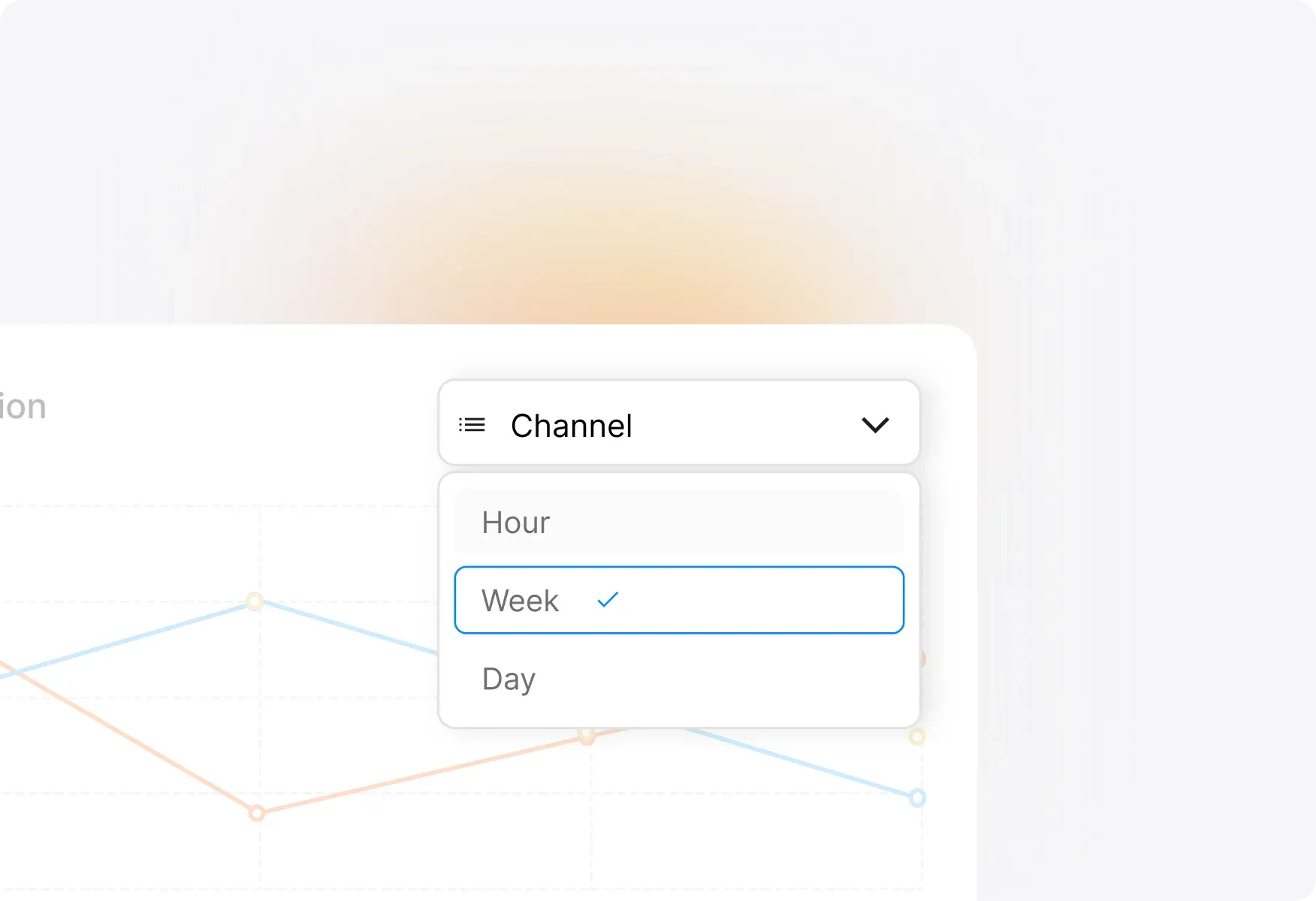
Spot Trends by Hour, Day, Month, or Quarter
Inflow Across Time
Analyze ticket inflow patterns over time with flexible visualizations. Choose from Timeline Tables, Heatmaps, or Line Graphs to quickly identify your most active and inactive periods—channel-wise and category-wise.
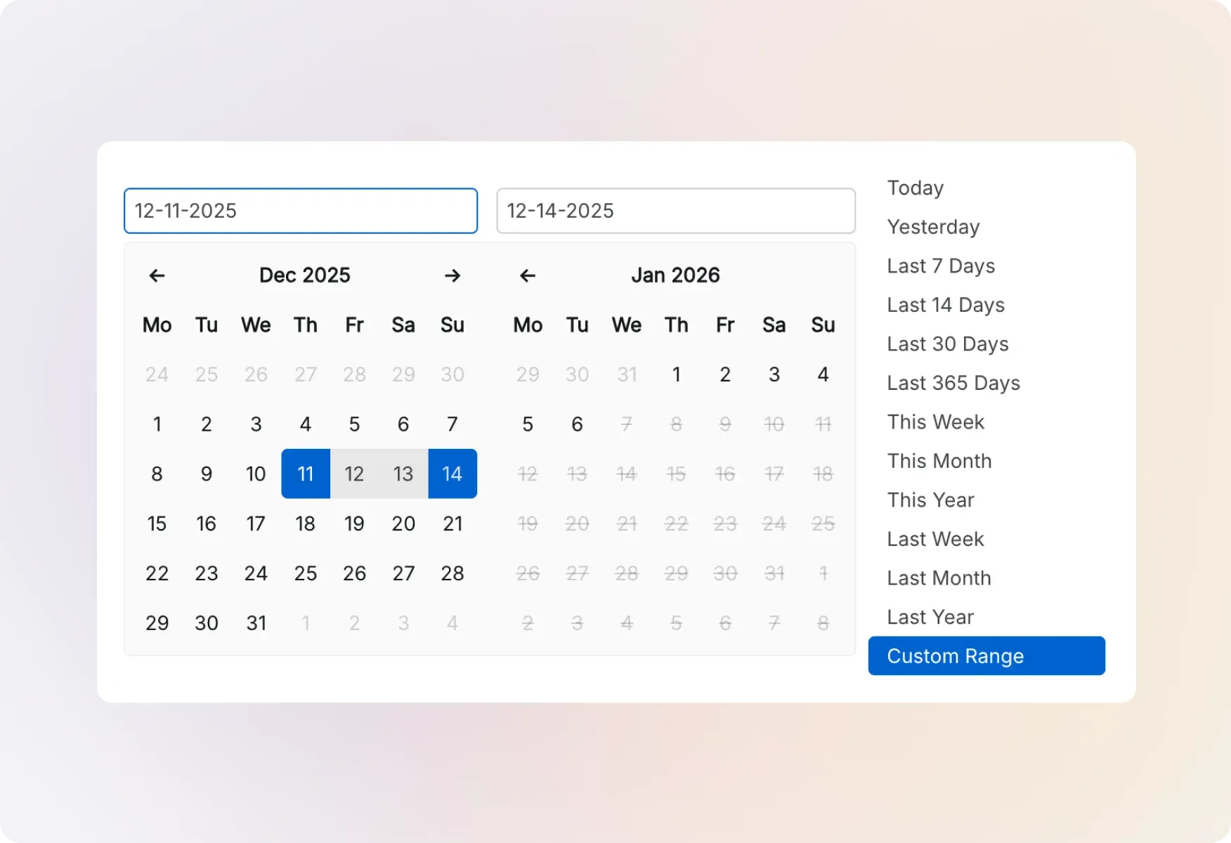
Refine Your View by Any Time Period
Flexible Time-Based Analysis
Filter and visualize inflow data by hour, day, month, quarter, or year. Understand seasonal patterns, plan for peak periods, and ensure you're never understaffed when it matters most.
Explore Other HappyFox Reporting Features

FAQ's
Know Your Ticket Patterns. Staff Smarter. Support Better.
Stop guessing when tickets will flood in—get complete visibility into your inflow trends and make data-driven decisions.

Use Cases
For Business Type
For Industries


Copyright ©2026 HappyFox Inc. All rights reserved.